

Assignment: Make 2 spreads for our magazine using InDesign. One of Lincoln and one of our own illustration.
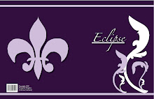
Craft: I started out by making boxes the size of what I thought the picture and text would fit in and adjusted them accordingly on the pages. I also used the text tool to create the title and by line which was on the second page. For the Lincoln spread I made the picture run across the middle and onto the other side of the page. It is extremely large. After putting in my text I added a pull quote and made it blue to match the color of the title. I wanted to make the illustration of Abe big and bold so the reader's eye is drawn to that first, then to the text. For the spread of my second illustration, I did it a little differently. I put the text and by line on the left page along with the picture which only fit that side of the page, it did not run over to the other one. On the right side I have all of the text along with a pull quote.
Composition: I did the layout for both projects differently. The title for Lincoln's along with the text was on the right side when the picture took up the whole space on the left. For the one with my illsutration I had the title and the picture on the left side which took up almost the whole page. Then I put just the text and pull quote on the right side. I chose a font for the Lincoln spread that I felt fit with the picture and text very well. It is a bulky text whereas the text for my illustration spread is flowy and matches the feel of the picture.
Concept: For both of the spreads I wanted the pictures to be the main focus. When I look at magazines I notcie the pictures along with the titles first and after seeing them I decide if I want to read that article. It is the first impression you get when flipping through a magazine. I also think that the title is very important so I made both of them stand out as much as I could but both look unique and relevent in both spreads. The colors I chose for the text and titles directly corolate with the pictures. I would use the eye drop tool and match the colors with those that are in the pictures to solidify the overall look.

No comments:
Post a Comment